 |
|
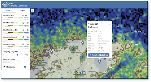
Zoom in of northern Columbia and Venezuela TRMM LIS
|
|
 |
|
Tropical Rainfall Measuring Mission (TRMM) Lightning
|
|
One of GHRC DAAC’s areas of expertise is with lightning observations. These data are quite popular as well, with multiple lightning datasets ranking in GHRC’s top 10 downloads each year. GHRC has been working to improve the utility of these data for users, which has included updates to data recipes and integrating data into the Field Campaign Explorer. The latest effort has been the development of the Lightning Dashboard.
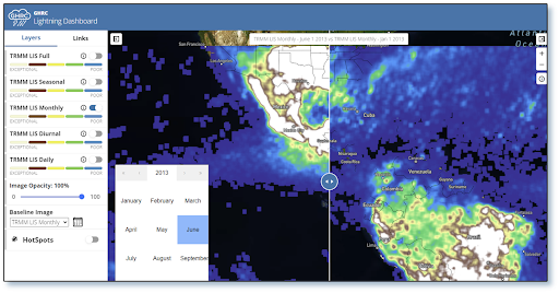
The Lightning Dashboard, currently as a minimum viable product (MVP) release, has been designed to provide visualization of lightning datasets as well as integrating basic analysis capabilities. The initial design is derived from NASA’s COVID-19 dashboard, highlighting NASA’s focus on open science. Users can display data, display histograms, and use a comparative slider tool. GHRC has also included the Tropical Rainfall Measuring Mission Lightning Imaging Sensor global hotspots derived by Albrecht et al. (2016). In addition to the visualization and analysis, the Lightning Dashboard includes data discovery components so that users may access documentation and additional information about the data used.
As an MVP product, the Lightning Dashboard will see updates in the year ahead. These updates will take several forms. Additional datasets, visualizations, and analysis tools will be made available. GHRC will also focus on improving the existing visualizations, such as modifying color curves to match the most commonly used versions in the community. Furthermore, these capabilities can be spun off into data recipes to enable users to create their own visualizations.
